Loxone
Your smart building. One app.
How much does Loxone cost?
Prices are current as of 9 Sept 2026.
Loxone has no in-app products on record in the United States.
10+ alternatives to Loxone
| Loxone |   ViCare ViCare |   Miele app – Smart Home Miele app – Smart Home |   DoorBird DoorBird |   Nuki Smart Lock Nuki Smart Lock |   Homematic IP Homematic IP | 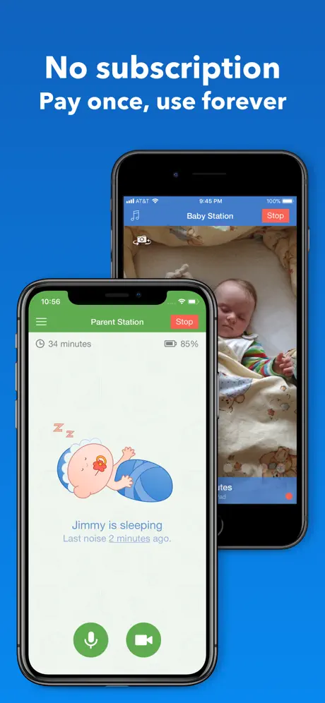  Baby Monitor 3G Baby Monitor 3G |   Philips Avent Baby Monitor+ Philips Avent Baby Monitor+ |   Shelly Smart Control Shelly Smart Control |   Liebherr SmartDevice Liebherr SmartDevice |   Casambi Casambi | |
|---|---|---|---|---|---|---|---|---|---|---|---|
| Rating / 5 | 4.2 | 4.5 | 4.4 | 4.4 | 4.6 | 4.6 | 4.7 | 4.7 | 4.2 | 2.3 | 3.0 |
| Reviews | 3.1K | 151K | 84K | 70K | 52K | 48K | 41K | 41K | 3.3K | 1.1K | 417 |
| Released | 2014 | 2016 | 2014 | 2015 | 2016 | 2015 | 2012 | 2021 | 2023 | 2021 | 2013 |
| Monthly price | — | $3.99 | — | — | — | — | — | — | — | — | — |
| Annual price | — | $33.99 | — | — | — | — | — | — | — | — | — |
The going rate for each plan in United States, in its own currency, shaded from the cheapest price on the row to the dearest.
Loxone reviews
4.2 out of 5, based on 3,138 reviews.
What people like
- System automates everything so you rarely touch switches
- Very stable and reliable for daily home control
- Developers release frequent updates with new features
- Intuitive interface that just works without fuss
What they complain about
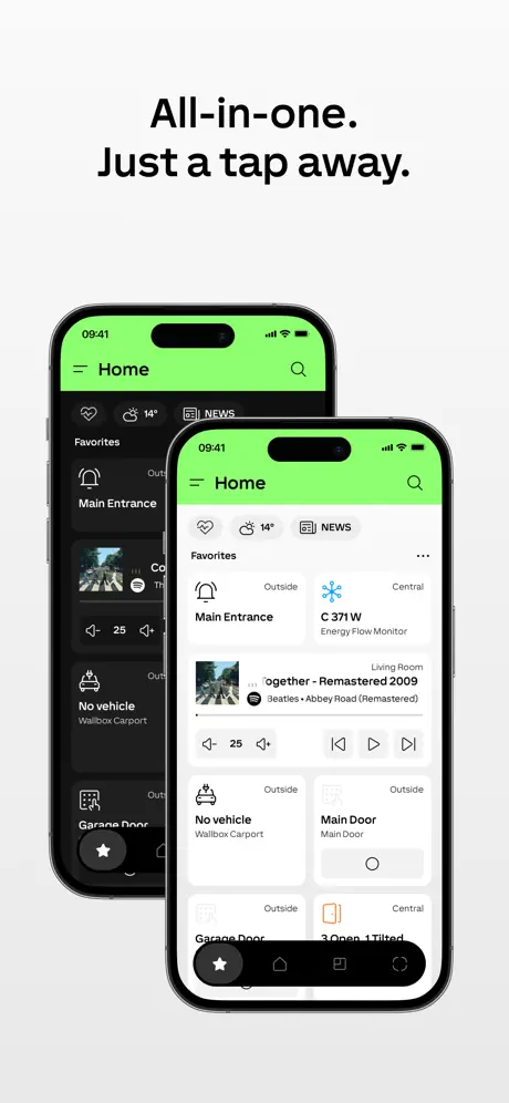
- Ugly bright green bar ruins dark mode
- App crashes or fails to connect to server
- New design is cluttered and hard to use
- Watch app has too few features and bugs
Time format
It’s working well now, 24 hour clock on all displays. Thank you. I really hoped the latest update would address the time display. It is still showing am and pm and not 24 hour clock on all the screens. There seems no way to change it. Support answered that they couldn’t reproduce the issue, but it is still there to see on all the photos on the App Store !! Still waiting for 24 hour clock on the Home Screen. Everything else is excellent, but this is very annoying! Please deal with this asap ! I love the app, but having the time displayed as am/pm rather than 24 hour clock seems a bit odd. Please make this a user selectable option. Thank you. Thank you for replying. You say you can’t reproduce the issue, but that is very strange as the very first picture in the App Store shows the time as 9.18 am!
Horrible
You have logged me out of all devices, the app doesn’t accept our password or our face ID and we cannot control anything in our home! What a “smart” home. They truly complicate your life. Do not sign up!
Kurzbefehle Funktion schlägt fehl
Ich nutze nun seit geraumer Zeit auf mehreren Apple Geräten die Loxone App und auch die Loxone Config zum programmieren und bin insgesamt sehr zufrieden. Das Design der Loxone App trifft meinen persönlichen Geschmack noch nicht zu 100 %. Doch ist durch das letzte Update sehr verbessert worden, was nun aber ein Problem geworden ist. Was schon mal funktioniert hat, ist die Verbindung mit Apple Kurzbefehle. Wenn ich einen Kurzbefehl erstelle, mit einer Ausführung in der App, Stürzt die App ab, dies tritt auf mehreren Geräten auf. Es wäre gut wenn es in einem Softwareupdate behoben werden würde.
App funktioniert mit IOS nicht mehr
Seit neuesten lassen sich die Regeln im Automatik Designer nicht mehr ändern, auch neue erstellen ist nicht mehr möglich.
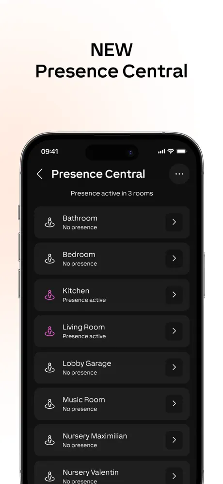
Aufwecken via Präsenz funktioniert nicht mehr
Leider seit den letzten iPadOS sowie Loxone App Updates auf beiden iPads gleichzeitig nicht mehr möglich
Works very well
Stable, reliable app. Regular updates and seems very well supported. Graphs of the statistical data should really allow simultaneous display of two or more dates. For example: outside temperature and energy consumption; heating flow and return temperatures.
Terrible update recently
I have tried for 30 mins to set hot water schedule after being on holiday and still can’t manage. There seems to be no edit option and the window in which to set time is indistinguishable from the other time windows. Only option is to delete everything and redo it as touching an entry on the schedule changes it at random.
Danke fürs zurück ändern
Dafür bekommt ihr als Danke auch wieder ein paar mehr Sterne. Ihr werdet sehen, niemand der User wird sich für das schreckliche Design entscheiden.
Quick Action Rückmeldung ausbaufähig
Das Feedback über die Befehle durch die QuickActions ist seit dem Update mehr oder weniger schlecht.
Proč?
Proč je to s každou novou aktualizací horší? Vraťte zpátky design co tam byl nebo upravte design tak jak vám to tady mnoho uživatelů. Jedna z věcí která své mě osobně je změna odezvy nějakého tlačítka nebo prvku na kliknutí nebo zapnutí. Mám tam dvě tlačítka ale po kliknutí jen slabě pronikne tak že to navíc zakrývá samotný prst kterým na to klikám takže to vůbec není vidět absolutně není poznat že se něco stalo! Aplikace pro hodinky po aktualizaci přestala fungovat to co dřív fungovalo. A to nemluvím ani o tom že je naprosto příšerná s tím že umí jen 4 úkony!?! Jako vážně? A i ty teď už nefungují. Jako vážně jste udělali aplikaci pro hodinky kde se dají nastavit jen 4 věcí!??? Hodinky jsou tak nevyužitý potenciál klidně by tam mohla být kompletní kopie celé aplikace pro mobil, protože samotná aplikace na rozdíl od konkurence nemá žádné obrázky a je to pořád klikací seznam prvků. Takže na hodinkách by mohl být ten samý seznam v jednoduchém textovém režimu, co je na tom tak těžkého? To by snad zvládlo AI za pár minut. Ale to co tam je teď je amatérský mizerný “jen aby se neřeklo” že nemáme aplikaci pro hodinky. Hrozně mě to štve protože jinak je loxone výborná aplikace ale to jako naprosto kašlou “doplňte si cokoli dalšího já nechci být sprostý” na zákazníky. Hlavně že se vychloubají jak jsou moderní a inovativni, ale je to v překladu jen to aby si mohli obhájit víc peněz. A aplikace pro hodinky je jen odskrtnuta položka v Excelu pro managery, a PR hele přece aplikaci máme tak co byste ještě chtěli.
Hard to beat
Being an early adopter of Loxone, I have seen how far this has come, and the continued evolution is amazing. Does exactly what you want it to do, both by programming and from within the app with auto designer…..
Colour & Smart buttons
The lime green is a terrible colour on an app, especially in low light; change it quickly for a neutral banner. The new ‘smart’ or quick access buttons at bottom of screen are a great addition BUT they need to be on every screen, not just selected ones (currently it’s not really smart) Loxone is great wiring system for your home; thank you.
Seit Update optisch eine Katastrophe
DANKE!!!! Endlich ist der grüne Balken weg 👍👍👍🙏👍🙏👍
Neuer Startscreen
Mit dem letzten Update wurde das Design der App zwar sichtbar verändert, leider jedoch nicht zum Positiven. Der neue Startbildschirm ist aus meiner Sicht klar misslungen: Ein grell weißes Logo auf tiefschwarzem Hintergrund, umgeben von halb- bzw. dreiviertelkreisförmigen Grafikelementen, erzeugt einen extrem harten visuellen Kontrast. Dieser Effekt ist unangenehm, überreizend und verursacht bei mir bereits nach kurzer Betrachtung Kopfschmerzen. Gerade ein Startscreen sollte ruhig, unaufdringlich und augenfreundlich sein – hier passiert das Gegenteil. Statt eines modernen Eindrucks wirkt das Design aggressiv und schlecht abgestimmt. Besonders problematisch ist, dass man diesem Bildschirm bei jedem Start der App zwangsläufig ausgesetzt ist. Das ist kein Detailproblem, sondern ein ernstzunehmender UX‑ und Accessibility‑Fehler. Ein überarbeitetes, weniger kontrastreiches und visuell ruhigeres Design wäre dringend notwendig. In der aktuellen Form mindert der Startbildschirm den Gesamteindruck der App deutlich.
Watch Komplikation verschwunden?
Hallo, kann es sein, dass es keine Komplikation mehr gibt? Ich habe darüber bisher die Tür geöffnet und das Licht gesteuert.
5 star app for a 5 star system
We have had the installation for about 6 months now and the App is the perfect accompaniment. Combined with the security features on your phone it is the perfect tool to do the basics and more. It is surprising just how much is possible on the App and at the same time how intuitive it is.
Horrible new screen
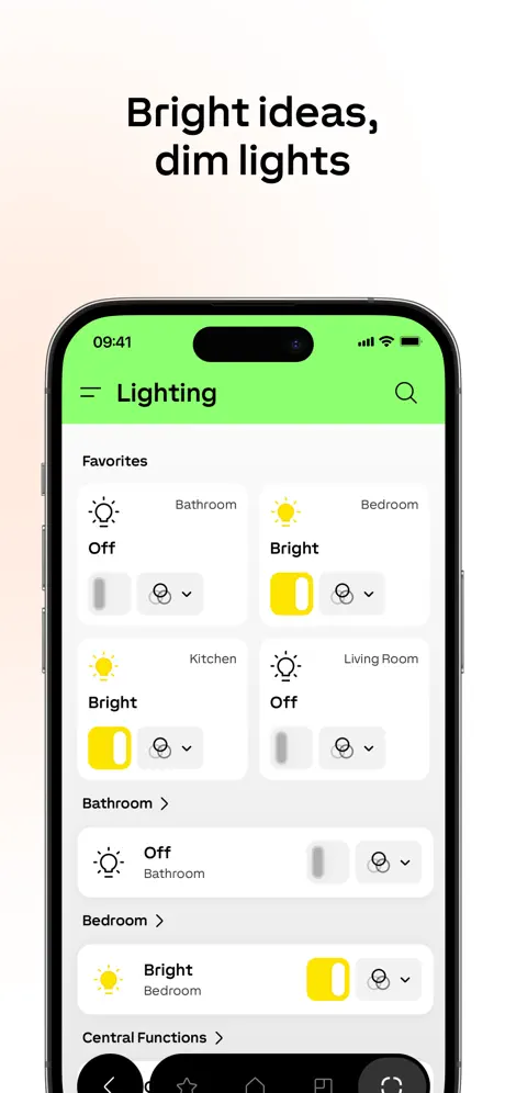
I loved Loxone but this recent update has plagued my view with a lime green banner which looks horrible and doesn’t fit in well with the dark mode that I have selected. Support tried to put a positive spin on it but it is absolutely horrible. Not something I want displayed on my walls on the tablets. Even after the ability to hide the header the search icon and the bottom selected favourite, room or category is highlighted green. The green is too bright compared to the rest of the icons and text to comfortably use in low light conditions which is in the evenings when I use the app most. Also when first opening the app I’m blinded with the entire screen green. I get it is your new brand I’m just saying I don’t like it and it was not what I signed up for when choosing to invest in Loxone products. Unless the horrible lime green can be changed in the app I’m afraid my rating will stay put as it is unwelcome. But by all means use this lime green on your PR stuff go nuts, just not in my house on my app or iPads please:-(
Das neue Layout als Chance begreifen
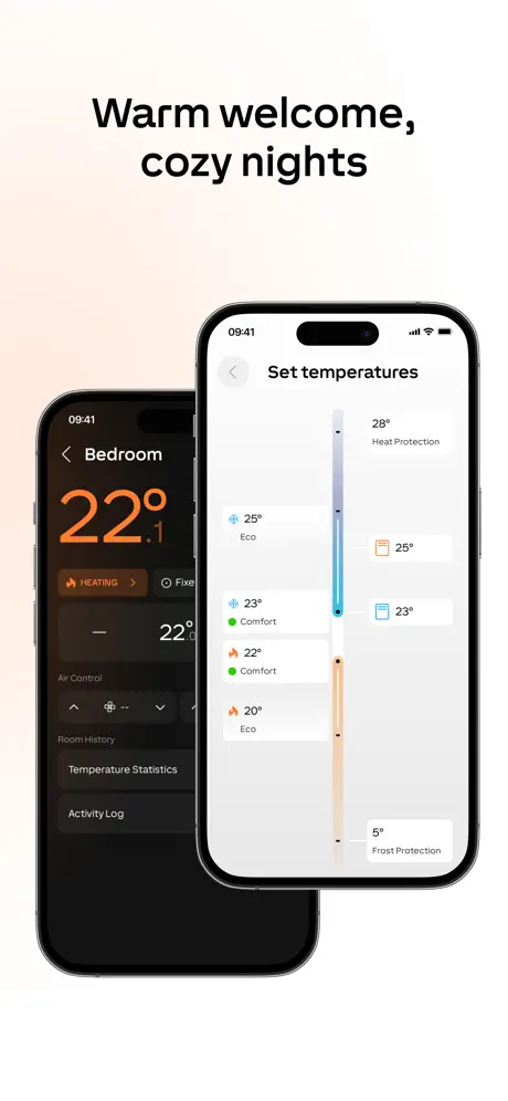
Ich bin erst seit etwas über einem Jahr dabei und installiere das System phasenweise. Die neue Version 17 der App hat ein fast komplett neues aussehen. Vieles ist anders geworden. Auf den ersten Blick ungewohnt. Den Entwicklern muss ich jedoch das Kompliment machen, dass vieles sich gebessert hat. Da wäre beispielsweise die Raumtemperaturregelung zu nennen. Diese ist nun intuitiver geworden. Einiges ist allerdings auch schief gegangen, wie z.B. das Usersetting. Nach Eingabe von Username und Passwort ist die App unter dem aktuellen iPadOS schwarz. Hier hilft nur ein Verlassen der App (weg-swipen) und wieder starten. Ich denke, dass bekommt das SW Entwicklerteam schon wieder hin. Bis dahin werde ich noch weiter auf Entdeckertour gehen.
Neues Design schlecht
Ich bin leider sehr unglücklich über das neue Design in der App, der grüne Balken ist extrem hell, platzeinnehmend und sinnfrei. App öffnen dauert nun auch länger um das Loxone-Logo einzublenden bevor alles geladen wird. Heizung hat nun einen Aus-Schalter, finde ich gut, allerdings muss man beim Wiedereinschalten alle Einstellungen neu machen, besser wäre hier eine Memory-Funktion, sodass man direkt wieder alle Werte von vor dem Ausschalten hat. Schön ist die neue Auswahl-Funktion der Licht-Stimmungen.
An sich gut...
...allerdings ist mir aufgefallen, dass die App sich versucht, öfter mal über extern zur verbinden, anstatt die lokale Verbindung zu nutzen. Es wäre wünschenswert, dass man dies in den Einstellungen der App ändern könnte, z.B. : Niemals externe Verbindung nutze / nur lokale Verbindung nutzen / beides nutzen. Ich bin immer im lokalen Netzwerk (draußen immer per VPN Verbindung), muss aber den online Service eingeschaltet lassen, um Wetter- und Push-Notifications nutzen zu können. Zudem ist mir mit dem heutigen iOS Update aufgefallen, dass ich die Raumreihenfolge in der App nicht mehr anpassen kann. (Ansonsten gute und solide App.) Leider muss ich das mit dem letzten Update revidieren, Spotify lässt sich nicht mehr verknüpfen, obwohl mir die App sagt, dass die Verknüpfung erfolgt ist und ich die Seite in der App schließen kann. Zusätzlich wird die Anordnung der Räume nicht immer richtig angezeigt - stattdessen die default Ansicht. Erst, wenn man einen Raum geöffnet hat und dann wieder zurückgeht, wird die individuell sortierte Raumreihenfolge angezeigt. update 21.04.2026 Die App funktioniert jetzt zuverlässiger und die oben genannten Themen sind, soweit ich das beurteilen kann, behoben. Nun gab es allerdings ein UI Update und es ist klar erkennbar, dass dies keine native App ist. Die Seitenübergänge fühlen sich falsch an, manchmal sind die Titel oben in der Bar doppelt vorhanden und überschreiben sich. Und die ganzen UI Elemente sehen einfach nicht nach iOS aus. Bitte bringt doch eine native iOS App raus, die sich auch nach iOS anfühlt.
Works every time
Can’t fault this app. Brilliantly intuitive.
Genuinely awful
If I could give minus stars I could. It only works half the time and the rest of the time it “cannot connect to server” even when I’m in my house!!!! The most frustrating thing in my life at the moment.
17.0.0
1.Please remove top green bar. It just takes space. 2. Bubbles when opening app? Why? 3. Energy monitor. Why production is now up consumption and not side by side?
Das neue Design
Hallo, das neue Neogrünichwolltemaleinlambowerdendesign ist schlicht furchtbar und stört mich und die ganze Familie. Ein greller, farblich an eine Erkältung erinnernder Balken, hämmert bei Dunkelheit nun gekonnt einem die Netzhäute raus. Neben den ohnehin schon ständigen Unzulänglichkeiten der App (Z.B. Favoriten) verdiente 2 Sterne.
Ne vse se pri aktualizaci podari
Neco dobreho pribude, neco prijemneho a funkcniho zmizi, neustale zmeny designu :(
The best smart home system by far
Loxone just works and the app is flawless, tried a few smart home alternatives over the years and they are very disjointed with multiple apps etc. Loxone is true smart automation, when the configuration is done right there is very little input required by anyone in the house. I cant remember the last time i pressed a light switch or adjusted heating, it is all looked after automatically.
V17 is horrible - Bring back Masters green
What on earth was the company thinking, the app is harder to use and an eye sore, what’s with the large day glow green banner, it looks nasty on my wall mounted iPad. Going into weather section it’s black and white, hard to read, the labels on the button icons have gone. This is Loxone’s Sonos moment I fear
Super App
Läuft seit dem letzten Update super. Eine Sache wäre noch schön - der grell grüne Balken in der App. Wenn man den Nachtmodus hat, blendet dieser ziemlich. Besser wäre im Nachtmodus ein schwarzer Hintergrund und die Loxone Schrift in grün.
Neues Design Geschmacksache
Bitte den großen grünen Balken oben wieder in schwarz machen oder sinnvoller nutzen!!! Das wirkt so, dass die ganze App nun kleiner ist. Wirkt sehr schlecht 😔
New Design 👎
The new design looks awful. The charts are to heavy. The green bar at top is extremely annoying in dark mode. The data values are all same color as labels. Visually very hard to orient.
The only true smart home system
I’ve had Loxone from virtually day one of its existence. Every year many new and exciting products are introduced and the existing devices in your system always complement the new devices and work well together. Hardly any (if any) of my smart home devices are 3rd party with the Loxone system so everything updates and continuously works faultlessly together. I absolutely love it.
Awful new design
Total mess of an update from what was a decent app. Shame!
Favourites
I used to be able to configure my favourite functions but now I can’t. Please put this feature back in the app.
13.1 is a backward step performance/usability
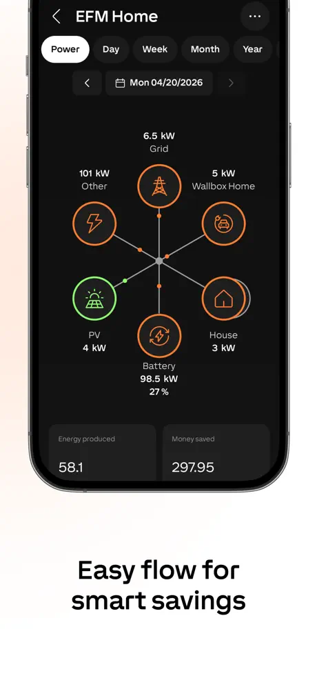
Whilst this latest 12.1 version may include new functions at the heart concerning energy management visualisation and car charger wall box control the UI changes and clunkiness has destroyed many good aspects of this app . UI Issues: this used to have very clear grouping of function and associated controls eg shading and the up/down functions with a clear concise and visually appealing dynamic icon. The separation of these entries in a category listing was neat and efficiently used screen real estate. The group was provided by grey shading boxes to draw the eye quickly and accurately to the grouping/controls/status. This has been destroyed with all black backgrounds, bold white oversized icons and fonts and not Grouo around controls. Additionally there is acres of ‘black space’ between entries meaning HUGE amounts of scrolling in what was once an efficient use of space. This is particularly noticeable with a Room view where the once neat appropriately sized room temperature tile is now huge with no defined area (as all backgrounds are now black) and the size of entries for shading, lighting alarm door/window contact status etc is now coupled with all the extra black space separating them means much scrolling to get to controls. Performance: previously highly responsive favourite or central functions such as door intercom video or gate control have become very slow to respond to a click requiring multiple finger stabbing and frustration. Stability: what used to be a very smooth startup and connect to mini server process is now a clunky and amateur experience with jerkiness and an overall amateur appearance. Same goes for switching between category/room/central/ favourite views. Loxone was a large investment in building or intelligent eco house and the Loxone app was the most used (and loved) app on my phone. Now it’s just a frustration to work with day to day and I need to downgrade this app as soon as I can. iPhone 12 Pro: iOS 16.1
Nefunkční řazení oblíbených
V poslední aktualizaci, nelze řadit oblíbené položky. Jinak je aplikace přehledná a funkční
Loxone the only complete smart home!
I have been using my Loxone smart home system and app for 5 years now. As a company Loxone have not stood still, they have continued to evolve the system and app (the best most complete smart home solution pound for pound) Loxone gives me total flexibility when it comes to smart lighting, heating, multi room audio & more!
What were you thinking.
Constant changes not always necessary. Stick to design language. The last iteration was great. This not so much. What’s the deal with the day glo yellow!!!
Certain formats hard coded
Please can you make it possible for the user (not the administrator) to be able to group individual controls together and name them. Also please allow users to change the format of the clock (currently always in 12h, no option for 24h)
Loxone review
The system is great but the trouble is we are forever losing connection. I’m worried when I put on the night alarm or general alarm that I won’t be able to take it off again obviously this is also a problem when opening or closing the blinds remotely etc etc
Ugly
I have loxne for more than 14 years. Everything is great but I don’t like the new colors. Also it would be very nice if some buttons could vibrate in phone when pressed + some visual effect. Sometimes I am not sure id i pressed garage open button… It would also be very cool if I could add some buttons directly to iphone desktop
Amazing System
We have this system installed at home. Both my wife and I love it. Having just got the newest version of the app, we’re even more impressed. So many new features as well new products being brought out all the time that we can chose to have installed if we want. The regular updates we get with Loxone are almost unheard of elsewhere in the professionally installed smart home world. And the overall experience blows Alexa, Nest, Philips Hue type products out of the water. Totally different league. We think very highly of our Loxone system and the app. Recommended.
Terrible new design cheap and tacky
What was once a classy app now looks cheap and nasty since 17, please revert back to the old scheme without the hideous day glow green bar !
Great update with watch support
Finally! Watch is support arrived, but for some reason it only allows 4 quick actions!???? Watch OS has a scroll wheel so it could easily have more?
Won’t load at all
I have tried to logging in to my account on the app but it keeps saying it can’t download the server file format so it is a crappie app if it does this. I have been trying to login for over a month and it keeps telling me to try again later.
Novy design
Aplikace jako takova je super. Ale po posledni aktualizaci je tedy za me oskliva. Kriklave zeleny pruh nahore. Nudne sedive ostatni ikony. Stara verze byla hezci..
Omg get this
I have had this for ages and it’s amazing! AND NOW IT WORKS WOTH MY WATCH!!
Cannot connect to mini server
After using the app for many years it has suddenly stopped connecting to my server. I have no way to control heating, lighting or alarms - the only things that have changed are recent apple upgrades and I’ve renamed some rooms
Not really for numpties
I like Loxone, but even as an informed user I struggle with configuration. A text book, online, would be really helpful.
Big change, but not better .....
The app has changed quite significantly - not all for the better. Now takes several extra push buttons to achieve the same function as before. Does not flow as well or as logical as previous version. Any why has room mode been removed??!! This was one of the best features of the previous version ......
Go back cross is in wrong place
New update has the cross conflicting with the where the time is. Needs fixing please!
Loxone FAQ
- Is Loxone free?
- Yes. The app is free, in all 175 countries it sells in, and it sells nothing inside it.
- Does Loxone have a free trial?
- No. None of its offers (US) come with a free trial.
- What are the best alternatives to Loxone?
- ViCare (4.5 from 150,519 reviews, premium from $3.99), Miele app – Smart Home (4.4 from 83,759 reviews) and DoorBird (4.4 from 70,490 reviews).
Loxone download
Last updated 1 month ago.
Loxone sells in 175 countries. It was released 11 years and 11 months ago, on 5 Nov 2014. It holds a 4.2 rating from 3,138 reviews.
Supports 23 languages: English, Bulgarian, Catalan, Croatian, Czech, Dutch, French, German, Greek, Hungarian, Italian, Norwegian Bokmål, Polish, Portuguese, Romanian, Russian, Chinese, Slovak, Spanish, Thai, Turkish, Ukrainian, Vietnamese.
How much does Loxone make?
Third-party estimates for the last 30 days, worldwide — not the store's own figures, which Apple publishes for nobody.