Beat 38% Activation: B2B SaaS Onboarding Benchmarks, Tests & Pricing

In 2026, the median B2B SaaS activation rate is roughly in the high 30s percent, and the metric that predicts whether a customer sticks around is not completion rate. It’s how fast they hit real value. Track median time to value and activation rate first, across session-1 and 7-day cohorts, before you touch anything else on your onboarding dashboard.
TL;DR:
- Achieving a median activation rate of around 38% indicates over half of users do not reach their first value, with top-quartile programs reaching 60-80%.
- Faster time to first value, especially under five minutes for self-serve SaaS, significantly improves 12-month retention, particularly if achieved within 14 days.
- Segmenting onboarding metrics by user type, product complexity, acquisition channel, and plan tier reveals specific friction points and guides targeted improvements.
- Replacing static forms with conversational intake and personalizing first-run experiences can boost activation by over 40%, often at the front of the funnel.
- Prioritize measuring activation and median time to value on dashboards, and align onboarding efforts with realistic benchmarks based on ARR and industry-specific median figures.
Table of Contents
- What Are the Key Onboarding Conversion Benchmarks to Track?
- What Do 2026 Onboarding Benchmarks Actually Look Like?
- Onboarding Benchmarks by ARR Band and Industry
- What Onboarding Tactics Actually Move Conversion?
- How Do You Measure Onboarding Benchmarks Reliably?
- How Does Competitive Pricing Data Complement Onboarding Benchmarks?
- Common Pitfalls That Sabotage Onboarding Conversion Efforts
- Why Segmenting Your Benchmarks Changes Everything
- How Personalization Lifts Onboarding Conversion Rates
- Do Multi-Channel Onboarding Touches Actually Help?
- How to Set Onboarding Conversion Goals You Can Actually Hit
- What Do Real Onboarding Conversion Wins Look Like?
- The Metric Priority for 2026
- Apppricer: Pricing Context for Your Onboarding Wins
- Sources
What Are the Key Onboarding Conversion Benchmarks to Track?
Most teams drown their dashboards in vanity metrics. Fix that by locking down five definitions and never letting anyone on your team use them loosely.
Activation rate is the percentage of new users who complete a specific, pre-defined action that correlates with retention, within a set window (typically 7 or 30 days). It’s not “logged in.” It’s “created a project,” “sent an invoice,” or whatever action your data shows predicts a paying, returning customer.
Time to first value (TTFV) measures how long it takes a new user to hit that first meaningful outcome. Time to value (TTV) is the broader version, sometimes tracking the full path to habitual use rather than the first spark.
Onboarding completion rate tracks what percentage of users finish your defined onboarding flow, whatever steps you’ve built. It’s the weakest signal of the group because a user can complete every step and never touch the feature that actually retains them.
Customer effort score (CES) captures how hard onboarding felt, usually via a single post-onboarding survey question.
A few instrumentation rules that separate clean data from noise:
- Use median TTV, not mean. A handful of enterprise accounts that take three weeks to onboard will drag your average into meaningless territory. The median tells you what a typical user actually experiences.
- Pick one activation event and defend it in writing. Teams that let activation drift (“well, this quarter we’re also counting X”) lose the ability to compare cohorts over time.
- Log session-1 events with unambiguous names, and analyze in 7-day, 30-day, and 90-day cohort windows so you can catch products with longer natural buying or setup cycles. Mixpanel’s own breakdown of onboarding metrics treats time to value, activation, and funnel analysis as the core trio worth building dashboards around, and that framing holds up well against 2026 data.
What Do 2026 Onboarding Benchmarks Actually Look Like?
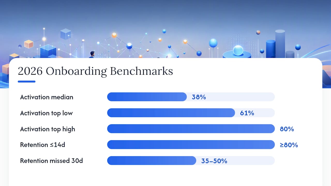
Here’s the number everyone wants and nobody quite believes when they hear it: the median activation rate across B2B SaaS in 2026 is roughly 38%. That means well over half of new signups never reach the value event that predicts they’ll stay. If your number is lower, you’re not broken. You’re average.
The gap that matters: top-quartile onboarding programs run at 1.6 to 2.1 times the median activation rate, according to the 2026 Customer Onboarding Benchmark Report. That’s the difference between a 38% median and a top-quartile range closer to 60-80%, depending on vertical.
The shape of “good” changes depending on how your product is sold:
- Self-serve SaaS should be chasing minutes-to-hours time to first value. Under 5 minutes is excellent territory; 5 to 20 minutes is typical and acceptable; anything creeping past 20 to 60 minutes starts bleeding users, according to Customerexperience.
- Guided onboarding (a human touches the account at some point) runs in days, not minutes, and that’s fine as long as your activation window accounts for it.
- Enterprise onboarding stretches into weeks, often gated by procurement, security review, or data migration that has nothing to do with your product’s usability.
Retention data makes the stakes concrete. Users who reach first value within 14 days retain at 80% or higher at the 12-month mark. Miss that 30-day window entirely, and retention craters to somewhere between 35% and 50%, per SaaS Magazine’s 2026 time-to-value analysis. That’s not a small gap. It’s the difference between a business model that compounds and one that leaks.
Use benchmarks as a compass, not a scoreboard. If you’re already near median, top-quartile targets (1.6 to 2.1x) become the more useful north star, and the tactics section below tells you which levers actually move that needle.
Onboarding Benchmarks by ARR Band and Industry
Benchmarks without context are just numbers on a slide. Where your product sits by ARR and vertical changes what “good” should mean for your team.
By annual contract value, TTV expectations stretch predictably:
- Under $5K ARR: self-serve, low-touch. TTFV should be measured in minutes; activation windows of 7 days are standard.
- $5K to $25K ARR: light-touch or guided. Expect TTV in days; some products still see activation inside a 7-day window, others need 30.
- $25K to $100K ARR: guided onboarding with a customer success touchpoint. TTV commonly runs 2 to 6 weeks; 30-day activation windows fit better here.
- $100K+ ARR (enterprise): procurement, security review, and integration work dominate the timeline. TTV in weeks to months is normal, and activation should be measured per-seat or per-workflow rather than per-account.
Industry medians vary just as sharply, and the 2026 benchmark data shows why lumping every SaaS company into one number is misleading:
- E-commerce tools: median activation around 62%, the highest of any category, largely because the value event (first sale, first synced product) is fast and obvious.
- Fintech: median around 44%, helped by clear, single-purpose actions like linking an account or completing a transaction.
- Vertical SaaS: median around 35%, dragged down by workflows specific to an industry that take longer to configure.
- B2B services and complex platforms: median around 29%, the lowest band, usually because the activation event requires multiple stakeholders or a data import before value shows up.
If your product requires a procurement cycle, multi-user setup, or integration with legacy systems, don’t benchmark yourself against e-commerce medians. Find your band, then compare inside it.
What Onboarding Tactics Actually Move Conversion?
Most onboarding “optimization” is theater: new tooltips, a redesigned progress bar, a slightly different welcome email. Here’s what the data says actually shifts the numbers.
- Replace static forms with conversational intake. Companies that swapped multi-field signup forms for a conversational, AI-driven intake flow saw a median 41% activation lift, a 64% reduction in time-to-first-value, and a 27% increase in trial-to-paid conversion, according to the State of AI Onboarding 2026 report. The mechanism is simple: instead of asking a user to fill out ten fields before they see anything, you ask three questions and route them straight to a personalized first screen.
- Cut form fields ruthlessly, then use progressive profiling. Collect only what’s required to show the first value event. Push everything else (company size, role, integrations) into in-app prompts after activation, when the user has already invested time and trust.
- Route by stated intent. Ask one question about the job the user is trying to do, then branch the entire first-run experience around that answer instead of showing a generic tour.
- Design experiments with guardrails before you ship. Set a minimum sample size per variant, define your primary KPI (activation, not clicks), and set a stop-loss threshold so a bad variant doesn’t run for three weeks before anyone notices.
The pattern behind all of this: AI-native onboarding, where the first-run experience adapts based on stated intent rather than a fixed tour, produced a 3.2x median lift over tour-based flows and 4.8x at top quartile in the same 2026 benchmark set.
Teams that skip the holdout almost always overattribute lift to the new flow when seasonal signup quality shifts are the real driver.*
How Do You Measure Onboarding Benchmarks Reliably?
Reliable measurement starts with discipline, not tooling. Define your activation event once, in writing, and calculate median TTV only among users who actually activated. Including never-activated users in a TTV average produces a number that means nothing.
- Use 7-day cohorts for self-serve products, 30-day for guided, and 90-day for enterprise, and never blend cohorts with different sales motions into one chart.
- Report median, not mean, everywhere TTV or TTFV appears on a dashboard.
- Calculate revenue impact by modeling LTV uplift: a 1-point gain in activation rate compounds into meaningful MRR without additional acquisition spend, since retained users don’t need to be re-acquired.
- Keep a standing dashboard with activation rate, median TTV, onboarding completion rate, and 90-day retention side by side, so no single metric gets read in isolation.
How Does Competitive Pricing Data Complement Onboarding Benchmarks?
Onboarding metrics tell you if users are activating. They don’t tell you if your pricing or trial structure is the reason they churn afterward. Competitive intelligence on subscription models and revenue trends, the kind Apppricer aggregates, helps you estimate the revenue upside of an activation win and check whether your trial length matches what similar apps actually charge for.
Common Pitfalls That Sabotage Onboarding Conversion Efforts
The most common mistake is optimizing completion rate instead of activation. Completion measures whether someone clicked through steps. Activation measures whether they got value. Research on onboarding metrics shows activation correlates far more tightly with retention than completion does, which means a completion-rate win can be a false signal.
A second pitfall: averaging TTV across incompatible cohorts. Blend your self-serve trial users with your enterprise pilot accounts, and the mean TTV becomes a number nobody can act on. Split cohorts by sales motion before you calculate anything.
Third, teams chase benchmark medians without checking whether they’re comparing the right vertical. A vertical SaaS company benchmarking itself against e-commerce activation rates will always look like it’s failing, when it’s actually just solving a harder problem with a longer setup path.
Fourth, and this one’s sneaky: shipping onboarding changes without a control group. Treat any single-cohort “before and after” result as a hypothesis, not proof, until you’ve run it against a holdout.
Fifth: letting the activation definition drift quarter to quarter. If marketing redefines “activated” to make a campaign look better, your historical benchmarks become useless for trend analysis.
Why Segmenting Your Benchmarks Changes Everything
A single activation number hides more than it reveals. The fix is segmenting by the variables that actually predict different onboarding behavior.
By user type: an individual contributor exploring a tool for personal use behaves nothing like an admin setting up an account for twelve teammates. Blend them into one activation rate and you’ll optimize for whichever group is louder in your data, usually the smaller, faster-activating one.
By product complexity: a single-feature tool and a multi-module platform shouldn’t share a TTV target. If your product has five core workflows, segment activation by which workflow a user first touches, rather than reporting one blended number that averages a 2-minute action against a 40-minute one.
By acquisition channel: users who arrive from a paid ad clicking “try free” behave differently than users referred by a colleague who already explained the product to them. Referred users often activate faster because they arrive with context. Report activation by channel, and you’ll often find your ad-driven signups are dragging your median down.
By plan tier: free-trial users and paid pilot users have different incentives to push through friction. A user who’s already paying is more forgiving of a clunky setup step than someone who hasn’t committed yet.
Segmenting doesn’t just make your reporting more honest. It tells you where to spend engineering time. If enterprise admins are activating fine but their invited teammates aren’t, the fix isn’t a redesign of the admin flow. It’s a completely different onboarding path for invited users, which most teams never build because they never segmented the data enough to see the gap.
How Personalization Lifts Onboarding Conversion Rates
Generic onboarding flows lose to personalized ones for a structural reason: a tour built for every use case is optimized for none of them. Top-quartile programs capture user intent at signup, typically through a single well-placed question, then branch the entire first-run experience around the answer, according to the 2026 benchmark research.
Personalization at its most basic level means routing. Ask what job the user is trying to do, then show them a first screen configured for that job rather than a blank workspace. A project management tool that learns a user wants to track client work, versus internal sprints, should show a different template on screen one. That single branch point often accounts for most of the activation lift teams see from “personalization” projects, before any AI sophistication gets involved.
The more advanced layer is timing. The same benchmark research found that the conversational or AI-assisted layer often owns re-engagement 24 to 72 hours after signup, nudging users who stalled out back toward the activation event with a message tailored to where they got stuck. That’s a meaningfully different job than the initial signup flow, and treating them as one continuous “onboarding email sequence” undersells how much intent-based branching matters at each stage.
Personalization isn’t free. Every branch you add multiplies your QA surface and your analytics complexity. The teams that get the most lift per unit of effort tend to personalize one decision point (intent at signup) extremely well, rather than building ten shallow branches that all convert marginally better than a generic flow.
Do Multi-Channel Onboarding Touches Actually Help?
Email, in-app messaging, and SMS each pull a different weight depending on where a user is in the funnel, and treating them as interchangeable channels wastes budget.
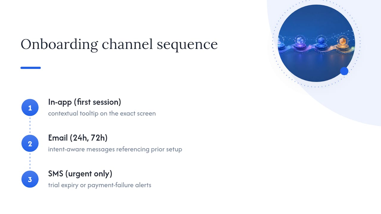
In-app messaging works best in the first session, when the user’s attention is already on your product and the context of what they’re doing is immediately available to reference. A tooltip that says “click here to import your data” lands because the user is staring at the exact screen where that action makes sense.
Email carries the load for users who leave the session before activating. A well-timed email at the 24-hour or 72-hour mark, referencing exactly what the user set up before they left, tends to outperform a generic “come back and finish setup” nudge. This is the window where conversational, intent-aware messaging shows its biggest lift, since it can reference the specific job-to-be-done the user indicated at signup rather than sending a one-size message.
SMS earns its place only for time-sensitive or high-intent moments, a trial expiring in 24 hours, a payment method that failed. Used more broadly than that, it tends to annoy rather than convert, and unsubscribe or opt-out rates climb fast.
The teams getting real lift from multi-channel onboarding aren’t the ones sending the most messages. They’re the ones sequencing channels by session state: in-app while the user’s active, email once they’ve left, SMS reserved for moments that genuinely can’t wait. Coordinate the messaging calendar across product and marketing so a user doesn’t get an in-app nudge and an email fighting for attention on the same action within the same hour.
How to Set Onboarding Conversion Goals You Can Actually Hit
Start with your vertical’s median, not an arbitrary round number pulled from a competitor’s blog post.
Once you know your band, set a two-tier goal. The first tier closes the gap to median if you’re below it.
Tie every goal to a specific cohort window. “Improve onboarding” is not.
Build in a floor for statistical confidence before you call a win.
Finally, budget realistically for the size of the lever you’re pulling. Swapping a signup form for conversational intake is a structural change and can plausibly move activation by double digits, in line with the 41% median lift seen elsewhere. A copy tweak on a welcome email is not that lever, and setting the same expectation for both guarantees disappointment for one of them.
What Do Real Onboarding Conversion Wins Look Like?
The clearest documented pattern in 2026 benchmark data is the AI-native onboarding shift. Companies that replaced static, form-heavy signup with conversational intake saw a median 41% activation lift and a 64% cut in time-to-first-value, with trial-to-paid conversion rising a median 27% across the 220-company benchmark set. That’s not a single company’s anecdote. It’s a pattern that held across a wide enough sample to treat as a real signal rather than a lucky quarter.
A separate, frequently cited case study documents a team that restructured their onboarding funnel and saw conversions climb roughly 200%. It’s a useful illustration of what’s possible when a team maps every drop-off point and fixes the worst one first, but treat any single-company case study as a hypothesis generator, not a benchmark. It doesn’t tell you which lever, or guarantee the same multiple.
The pattern that connects both examples: the biggest wins came from removing friction at the very first interaction, not from polishing steps five through ten of an onboarding checklist. Whether that meant swapping a form for a conversation or restructuring a funnel’s early steps, the leverage sat at the front of the experience, where the largest share of users drop off before ever reaching a value event.
The Metric Priority for 2026
Activation and median TTV should own your onboarding dashboard in 2026. Prioritize conversational intake, measure over an 8 to 12 week rollout, and judge success by activation lift, not completion.
— Sergey
Apppricer: Pricing Context for Your Onboarding Wins
Once your activation rate starts climbing, the next question leadership asks is what it’s worth. That’s where onboarding benchmarks alone leave a gap: they tell you conversion moved, not what a comparable app’s subscription structure implies about the revenue sitting on the other side of that lift.
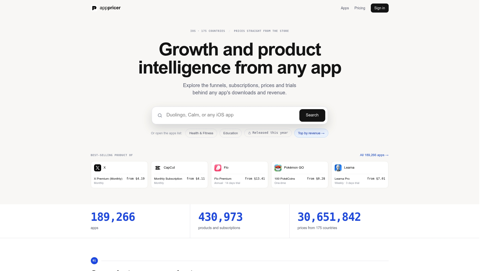
Apppricer aggregates real subscription prices, trial structures, and revenue trends from iOS apps across 175 countries, so growth teams can check whether a competitor’s higher activation correlates with a shorter trial, a lower price point, or a different paywall placement. Pair that market signal with your own activation and TTV data, and a 5-point activation gain stops being an abstract KPI and becomes a modeled revenue number you can defend in a planning meeting. Browse pricing and subscription data across iOS apps to benchmark your own trial structure against category leaders, or visit the Apppricer platform to see how competitive revenue and download trends map onto your next onboarding experiment.
Sources
Check your own activation and TTV definitions against these before comparing numbers: the 2026 Onboarding Benchmark Report, Mixpanel’s onboarding metrics guide, and SaaS Magazine’s retention data. For tactical CRO methods applicable to onboarding screens, see Baby Love Growth’s 2026 CRO guide.