Fivefold Gaps in 60 Days: Cohort Analysis for Subscription Apps

Cohort analysis apps group iOS apps by launch date, price tier, monetization model, and country, then track how revenue and downloads move over time. That lets you see exactly where a pricing decision is quietly losing money. Apppricer applies this across 175 countries, and benchmarks like RevenueCat’s SOSA 2026 report confirm the payoff: geographic pricing gaps show up in the data within the first 60 days, not months later.
TL;DR:
- Pricing gaps between North America and Southeast Asia or India appear within the first 60 days, making early localization experiments critical.
- Defining cohorts by release date, price, billing period, monetization model, and country ensures accurate analysis, especially with at least 200 to 300 installs weekly per country.
- Core metrics like revenue per install, conversion rate, refund rate, and retention curves should be analyzed together on days 30 and 60 for reliable pricing insights.
- Running staged tests with 2-3 price points per country, focusing on PPP-based local prices, prevents misleading results from currency conversions or store ladder misalignments.
- Automating cohort comparisons using platforms like Apppricer accelerates insights, supports competitor benchmarking, and streamlines ongoing pricing adjustments.
Table of Contents
- What Is Cohort Analysis for Apps, and Why Does It Matter?
- How Do You Define the Right App Cohorts?
- Which Metrics Actually Tell You Something Useful?
- How to Run a Pricing Cohort Experiment Step by Step
- Turning Cohort Signals Into Pricing Decisions
- What I’ve Learned Reviewing App Pricing Cohorts
- Run Your Pricing Cohorts Without the Manual Spreadsheet Work
- Sources
What Is Cohort Analysis for Apps, and Why Does It Matter?
Cohort analysis, as an industry term, means grouping a population by a shared starting condition (signup date, price paid, country of purchase) and comparing how each group behaves afterward. Applied to apps, that population isn’t individual users inside your own product. It’s competing apps, or your own app’s country and pricing variants, tracked side by side on revenue and downloads.
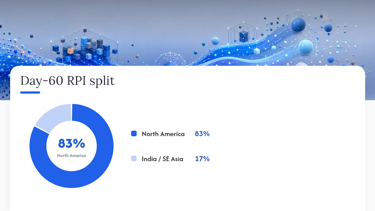
The reason this matters shows up fast in the data. RevenueCat’s SOSA 2026 findings put median revenue per install at Day 60 at roughly $0.55 in North America versus about $0.11 in India and Southeast Asia. That’s not a rounding error. It’s a five-fold gap that appears within two months of launch, well before most teams even glance at country-level breakdowns.
Localization experiments consistently rank as the top-performing category in paywall testing, which is exactly why country cohorts deserve priority over generic A/B tests on button colors or trial length.
Apppricer builds this kind of comparison directly into its platform:
- Pricing and subscription data aggregated across 175 countries
- Revenue projections and download trend tracking by app, category, and country
- Side-by-side cohort comparisons against named competitors, not just your own historical baseline
Statistic Callout: North American apps generate a median Day-60 RPI near $0.55, compared to roughly $0.11 in IN/SEA markets, according to RevenueCat’s 2026 SOSA data.
Internal product analytics tell you how your own users behave. They can’t tell you that a competitor three price tiers below you is capturing the same country at four times your conversion rate. That’s the gap market-intelligence cohorts fill.
How Do You Define the Right App Cohorts?
Sloppy cohort definitions produce sloppy conclusions. Before running any pricing experiment, lock down these five grouping keys.
- Release cohort. Apps launched in the same quarter face the same store algorithm changes and seasonal demand, so comparing a 2023 launch to a 2026 launch skews results.
- Price tier. Group by actual price paid, not list price. A $4.99 monthly plan with a 40% discount voucher behaves like a different product than one without.
- Billing period. Monthly and annual subscribers are not the same cohort. Airbridge’s 2026 benchmarks show annual subscribers retain at 44.1% after 12 months versus 17.5% for monthly, a gap that alone can explain half a revenue difference you’d otherwise blame on price.
- Monetization model. Hard paywall, freemium, and free-trial-to-paid apps convert on completely different timelines and need separate baselines.
- Country and store. iOS pricing ladders vary by country, so a $9.99 US price maps to a different local number, and sometimes a different psychological price point, everywhere else.
The real insight comes from combining these keys. A monthly-billed, high-price cohort in India or Southeast Asia will almost always underperform the same tier in North America, but a monthly-billed, PPP-adjusted entry tier in the same country can flip that result entirely.
Pro Tip: Don’t trust any cohort with fewer than 200 to 300 installs per country per week. Below that, day-to-day noise swamps the pricing signal, and you’ll chase phantom trends that vanish the following month.
Measure at Day 30 and Day 60. Day 7 catches initial reaction but misses the refund and churn behavior that determines whether a price actually holds up.
Which Metrics Actually Tell You Something Useful?
Five numbers do most of the work in app cohort analysis, and each one answers a different question.
- Revenue per install (RPI) at Day 30 and Day 60 tells you the dollar value a country or price tier is actually generating, not just how many people downloaded it.
- Download-to-paid conversion at Day 7 and Day 35 separates apps that hook users fast from those that convert slowly through trial nurturing.
- Year-1 value per payer captures whether a cheap plan with high volume beats an expensive plan with low volume once churn plays out.
- Refund rate flags billing friction or price shock before it shows up anywhere else.
- Retention curves by cohort reveal whether people who convert are actually sticking around.
Statistic Callout: Airbridge’s data shows the common monthly subscription price sits at $9.99 with a category median of $6.68, a gap worth checking your own pricing against before assuming you’re competitive.
Reading these together is where the real diagnosis happens. Low RPI paired with high download volume in a specific country usually points to a pricing mismatch, not a bad product. High conversion paired with weak Day-60 retention usually means onboarding is broken, or refunds are eating gains that looked real on Day 7.
The decision rule is simple: if RPI is low but conversion is healthy, test price. If conversion itself is weak, fix the funnel before touching price at all. Structured pricing tests judged on Day 30/60 RPI consistently outperform same-day-conversion snapshots, which tend to reward whatever spikes fastest and fades just as quickly.
How to Run a Pricing Cohort Experiment Step by Step
A pricing test without a defined stop point is just a permanent price change wearing an experiment’s clothes. Here’s the sequence that avoids that trap.
- Pick the cohort and hypothesis. Start with a country where your current price likely sits far above local purchasing power. A PPP-baseline hypothesis (say, “our price is 3x the local Big Mac Index ratio”) gives you something concrete to test against.
- Choose two to three price points. Test a PPP-derived entry price, your current price, and one point between them. More than three variants dilutes your sample too thin to read cleanly.
- Roll out by country, not randomly. Staged country rollout avoids the currency and store-ladder confusion that comes from mixing regions inside one A/B group.
- Measure RPI at Day 30 and Day 60, alongside cost per subscriber (CPS), so you know whether the win holds after acquisition spend.
Pro Tip: Set your stop/iterate rule before launch: a win means RPI improves without refund rate climbing more than a point or two. Anything murkier than that, extend the test rather than call it early.
Apple’s price point ladder and periodic tax changes mean prices drift even when you never touch them. Review pricing quarterly, spot-check volatile markets monthly, and re-check immediately after any store-wide tax or currency update.
Turning Cohort Signals Into Pricing Decisions
Diagnosis is only useful if it changes what you do next week. A few patterns show up often enough to act on without further debate.
- Low RPI, high download volume in one country: build a PPP-derived entry tier with proper local rounding rather than a straight currency conversion. Spotify and Netflix both run India-specific entry tiers for exactly this reason, and the pattern holds across subscription categories.
- Hard paywall cohorts converting well but refunding more: fix billing reliability and paywall messaging before scaling spend, since a refund spike quietly cancels out a conversion win.
- High cost-per-subscriber tied mostly to annual plans: shift acquisition budget toward the channel and billing period actually producing those subscribers, since annual retention already outperforms monthly by a wide margin.
What I’ve Learned Reviewing App Pricing Cohorts
The mistake I see most often is a single global price applied everywhere, then blamed on “the market” when a country underperforms. It’s rarely the market. It’s a price built for North American purchasing power sitting untouched in a country where it’s three or four times the local norm. The second-biggest mistake is ignoring store price ladders entirely, treating a currency conversion as a finished price instead of a starting point that still needs rounding to local psychological price points.
If I had to pick three quick wins for a team starting today: build an India entry tier this quarter, test a hard paywall in exactly one market before rolling it out everywhere, and automate country price audits so drift gets caught before it costs a full quarter of revenue.
— Sergey
Run Your Pricing Cohorts Without the Manual Spreadsheet Work
Building these cohorts by hand means scraping store pages country by country and hoping your currency conversions stayed current. Apppricer replaces that with aggregated pricing and subscription data across 175 countries, so a cohort comparison that used to take a week takes an afternoon.
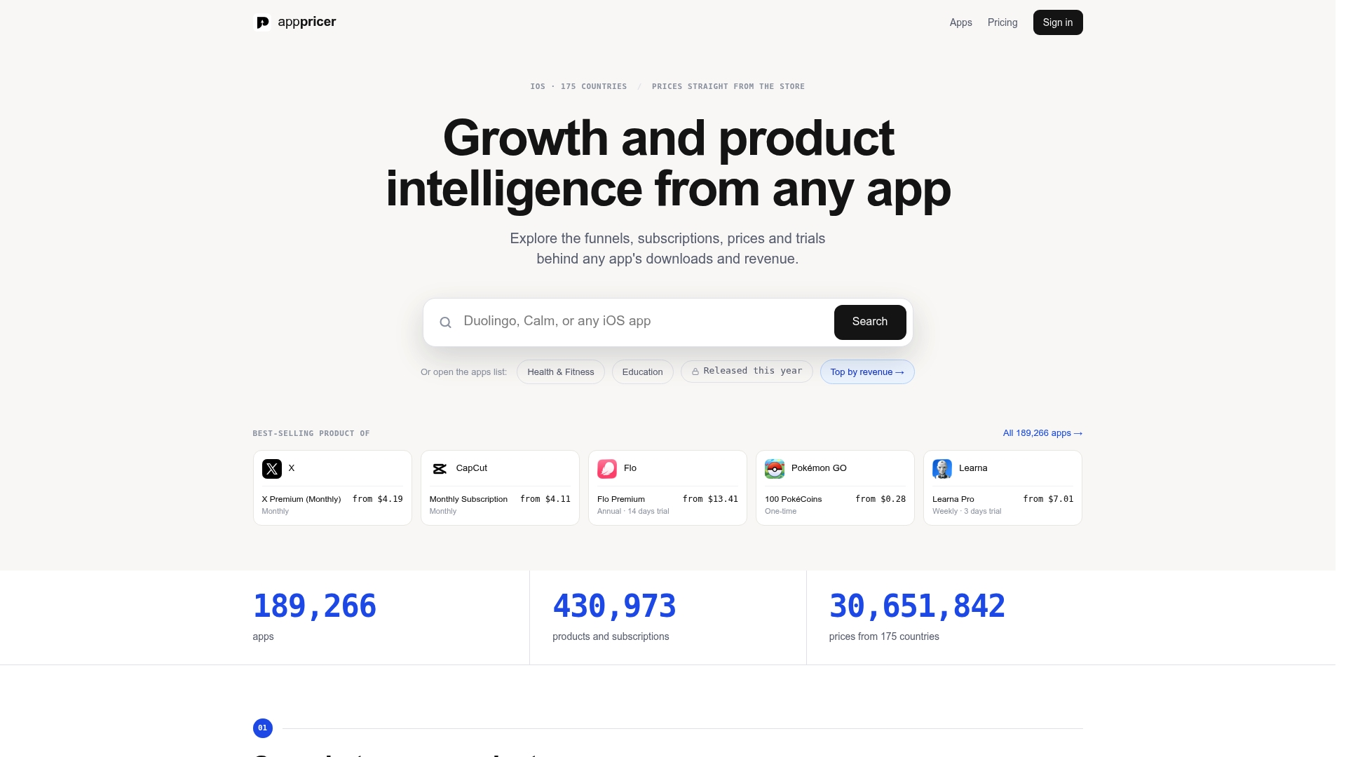
The platform pulls competitor pricing, subscription structures, and revenue projections into one comparison view, letting you group by price tier, country, or monetization model without rebuilding the dataset every time a hypothesis changes. That means faster validation on a PPP entry-tier test, clearer read on whether a channel’s high CPS is worth its billing period mix, and API access if you want cohort data flowing directly into your own reporting stack. Pair that pricing view with a look at how competing apps structure retention offers, since pricing and retention tactics tend to move together once a cohort test succeeds.
Browse real app pricing and subscription examples to see how competitors in your category are structuring their tiers right now, or check the full platform overview to start mapping your own cohorts today.
Sources
- Subscription app pricing by category: 2026 benchmarks — Airbridge
- App Price Localisation by Country (PPP Guide)